Responsive People Ghost Theme

Sample excerpt, The design originated from geometrical shapes with low-contrast and it features some graphic singularities that make it pure and elegant but yet reasonably curvy and funny. Lower-cases a g j and y are the best demonstration of that balance.
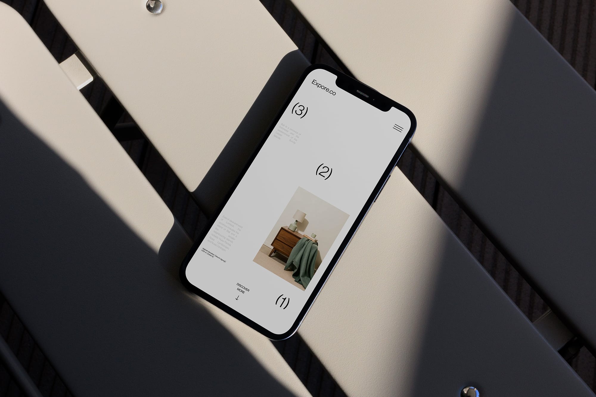
A Theme That Adapts to Every Story, Every Screen
In today’s world, your content doesn’t live on just one screen. People visit your website from phones, tablets, laptops, and everything in between. That’s why responsive design isn’t a bonus — it’s a necessity.
The People Ghost Theme understands this deeply. It was built to flow, scale, and adjust without losing the soul of your story. Whether you're sharing interviews, personal thoughts, or professional updates, People delivers a clean, elegant experience — everywhere.
Why Responsiveness Matters
Have you ever visited a website on your phone, only to zoom and scroll awkwardly just to read a paragraph?
A truly responsive theme solves that.
With the People theme:
- Your thumbnails resize beautifully
- Your text always fits the screen comfortably
- Navigation feels natural on touch devices
- Nothing breaks — from blog posts to profile pages
It's not just mobile-friendly. It’s mobile-ready.
Layouts That Adapt
One of the standout features of the People theme is how content layout adjusts depending on the screen size:
- Grid views collapse gracefully into stacked layouts
- Sidebars (if used) move down instead of overlapping
- Images and thumbnails scale without distortion
- Tags, authors, and metadata reposition with balance
Whether someone is reading on a 27-inch desktop or an old iPhone, the experience feels thoughtful — not broken.
Simple Customization, Consistent Results
You don’t have to tweak CSS every time you change a layout or feature. The People theme was built with smart defaults and snippet-ready structure, making customization simple:
- Show or hide thumbnails, authors, and tags per post
- Switch between classic or full-width layouts
- Keep your site clean and fast, even as it grows
The responsiveness is built into the DNA — so you can focus on your content, not technical bugs.
A Theme for Writers, Thinkers, and Builders
Whether you're running a blog, a publication, or a studio site, the People theme offers the kind of flexibility that respects your work and adapts to your audience.
Because your readers aren’t always sitting at a desk. They’re on the move. And your site should move with them.
The People Ghost Theme is responsive by design, flexible by intention, and ready for your voice.
Want a demo or setup tips? We’re here to help you build your story — responsively.
You May Also Like
 New
New