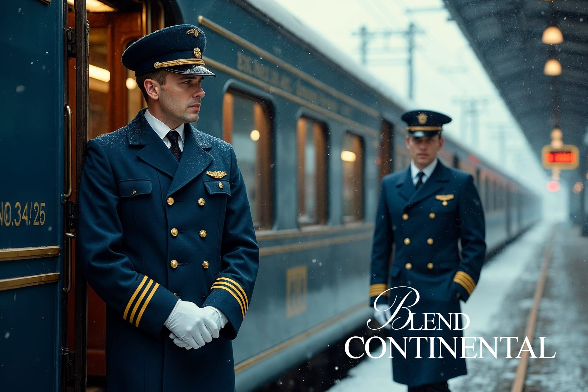
Blend Continental is People Ghost Theme

When I first discovered the "People" theme on Ghost, I was struck by how well it balanced two seemingly opposite design worlds: classic editorial elegance and modern digital polish.
How the "People" Theme Merges Classic Structure with Modern Flow
When I first discovered the "People" theme on Ghost, I was struck by how well it balanced two seemingly opposite design worlds: classic editorial elegance and modern digital polish.
It reminded me of something timeless — like a well-traveled journal that now lives on the web. This perfect mix is what I call a Blend Continental — a theme that respects the past but thrives in the present.
The Soul of “People”: Editorial First
At its core, the People theme is designed with writers and publications in mind. You can feel its classic roots in:
- Generous white space
- Clean typographic hierarchy
- A layout that feels like reading a well-designed magazine
Everything is built to focus attention on the writing. Whether you're publishing an interview, a journal entry, or a deep editorial piece, the theme steps back and lets your voice lead.
Where Modernity Kicks In
But People doesn’t just stay in the past. It brings modern functionality and visual cues that keep it fresh:
- Thumbnail layout options: Posts can feature full-width or boxed thumbnails, making visual storytelling flexible
- Tag and author toggles: You can easily show or hide authors, tags, and dates from post cards with simple edits
- Responsive behavior: Everything resizes elegantly across devices without losing structure
- Hover effects and clean transitions: Just enough interaction to feel alive, without getting flashy
This is what makes People stand out — it's not trying to impress with complexity; it impresses with clarity.
Customizing the Blend
When I started using People, I wanted to personalize it further without losing its core feeling. Here’s what I explored:
- Thumbnail Flexibility: Switched between classic and full-width thumbnails depending on post type — a photo story got the full-width treatment, while shorter updates stayed compact.
- Minimal Metadata: I customized the layout to hide author names on specific posts, especially personal journal entries where I wanted the post to stand alone.
- Tag Highlights: With just a few CSS tweaks, I styled tags to float over thumbnails like visual anchors — helpful for categories like “New,” “Interview,” or “Feature”.
These adjustments were lightweight, but the effect was powerful — it felt like a modern publication shaped by my own voice.
Why This Theme Still Inspires Me
People proves that you don’t need a thousand settings or a complex builder to create a compelling site. With just the right structure and flexibility, it becomes a blank page with personality.
It respects your writing. It adapts to your visuals. And most importantly, it gives you room to grow.
Final Thought
“Blend Continental” isn’t a feature — it’s a feeling. And People captures that feeling beautifully. It’s the kind of theme that lets you blend eras, ideas, and intentions — all while staying true to yourself.
If you're just starting out on Ghost or looking to rebuild your digital home, the People theme is a brilliant place to begin. It carries classic DNA, but walks confidently into the future.
You May Also Like
 New
New